It’s that time again! When the color gods analyze what is happening in the design world (and the actual world) to set the tone for the year by announcing their colors of the year. Some companies release just one color, some release a whole collection of colors, and this year Graham & Brown even released a wallpaper of the year! I love it all. If you have been following along with this little blog of mine for a while, then you know that I usually focus on the Pantone Color of the Year. Last year, I added in Benjamin Moore’s Color of the Year because I just loved it so much. This year, there were so many color trends that I loved, I couldn’t contain my excitement, so I decided to just do one big blog post (with a ton of photos) highlighting my favorite interior design color trends for 2021.
Pantone Color(s) of the year: Illuminating and Ultimate Grey
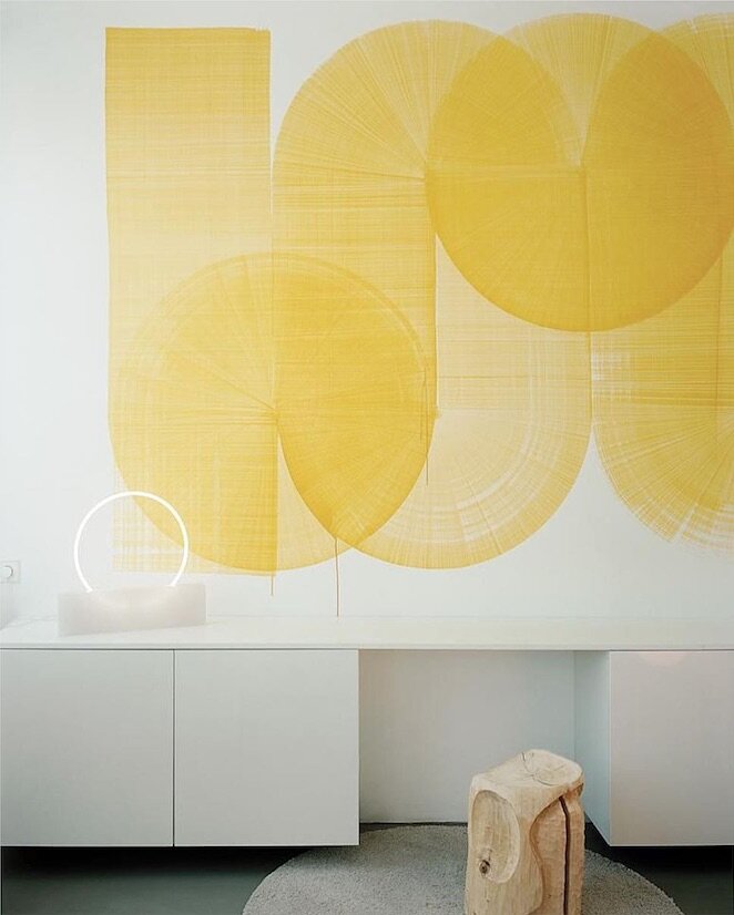
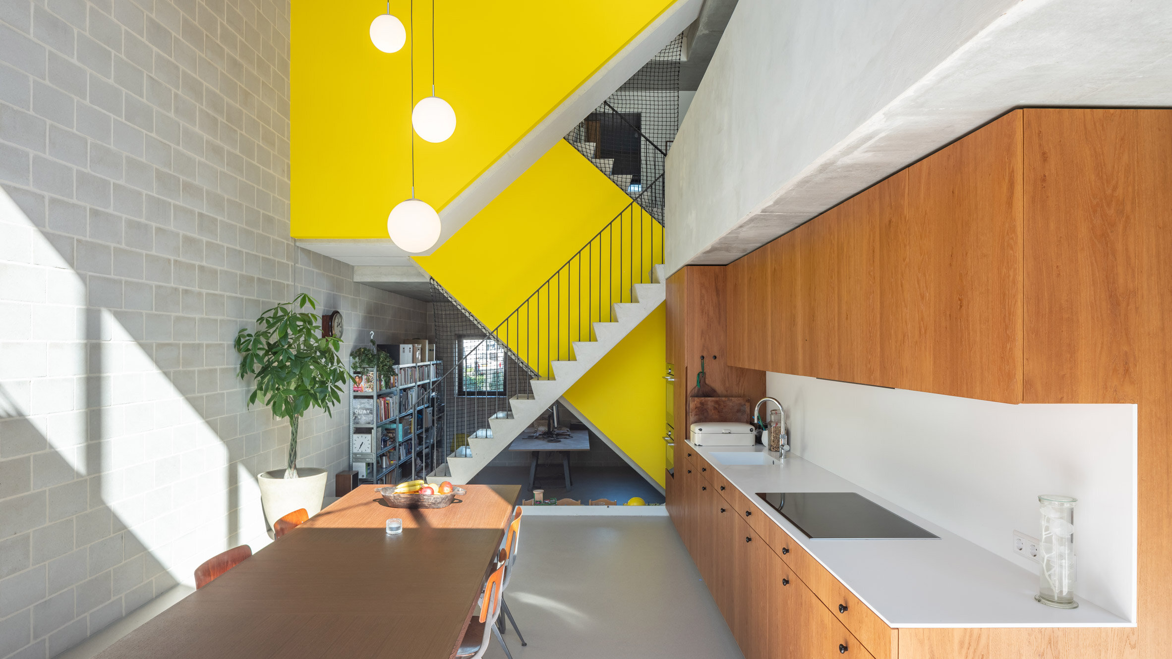
I have to begin with Pantone. For the first time ever, they released 2 colors, Illuminating and Ultimate Grey. Pantone tends to focus on what is happening in the world when picking their COTY, and this year isn’t any different. Pantone said this color combo is, “A marriage of color conveying a message of strength and hopefulness that is both enduring and uplifting.” I think we can all agree that strength and hopefulness is exactly what we need right now. I pulled together some of my favorite designs below that build on this classic color combination. Scroll through and please click on the links below the photos to explore more works from these amazing designers.
Benni Amadi Interiors with Illuminating Door Color
Bright yellow and grey tile Mercury Mosaics via Instagram
Modern Rustic #15 from Living Etc. yellow and grey kitchen design
Image via ItalianBark bright yellow modern art
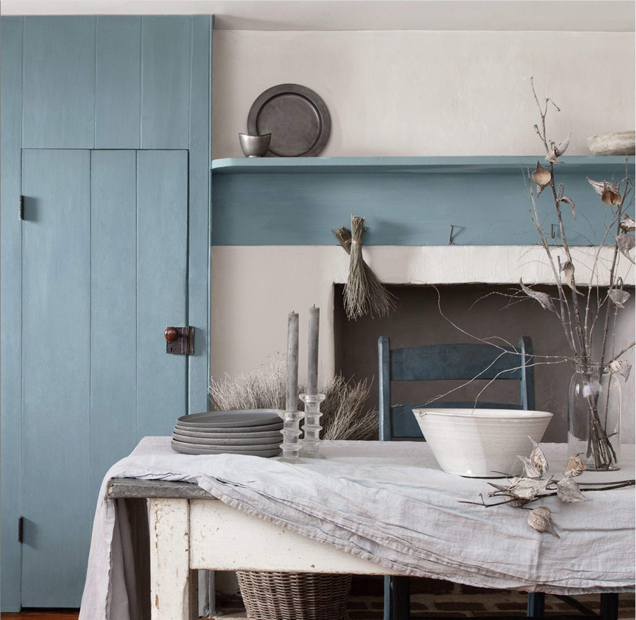
Benjamin Moore Color Of the Year: Aegean Teal
Up next… Benjamin Moore! The 2021 Color of the Year for Benjamin Moore is Aegean Teal, a beautifully calming cool tone that also brings you so much warmth. I throw a version of this color into so many of my designs because it brings a gorgeous pop of color to a room without being too loud. Some of my clients don’t love color as much as I do, so a calming teal is one of my “gateway colors” of choice.
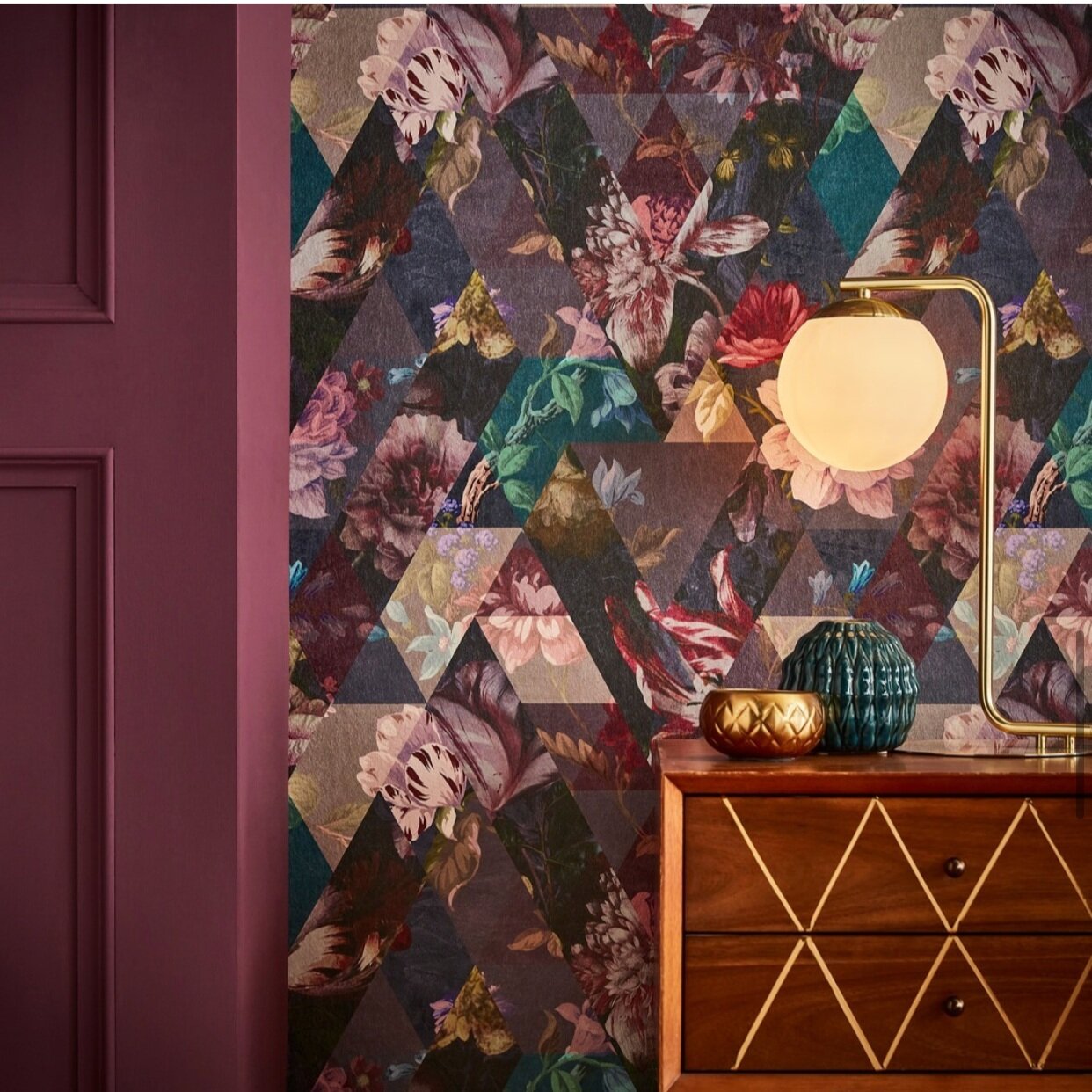
Graham and Brown Color of the year: Epoch
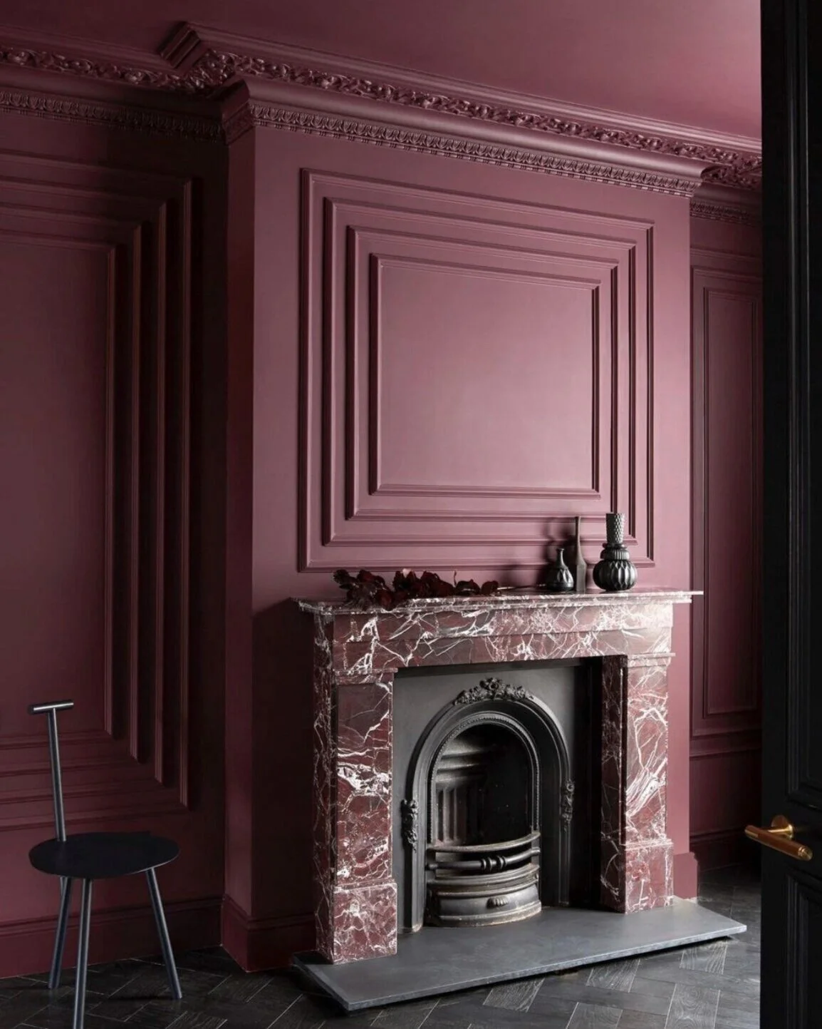
Guys, this color of the year from Graham and Brown…. it is everything. You know how much I love jewel tones, so when I saw this gorgeous deep amethyst color I couldn’t stop scrolling. Give me all of the deep maroon and purple inspiration.
Well, they were right, it triggered creativity for me. Scroll down for some seriously rich and moody Epoch inspired designs.
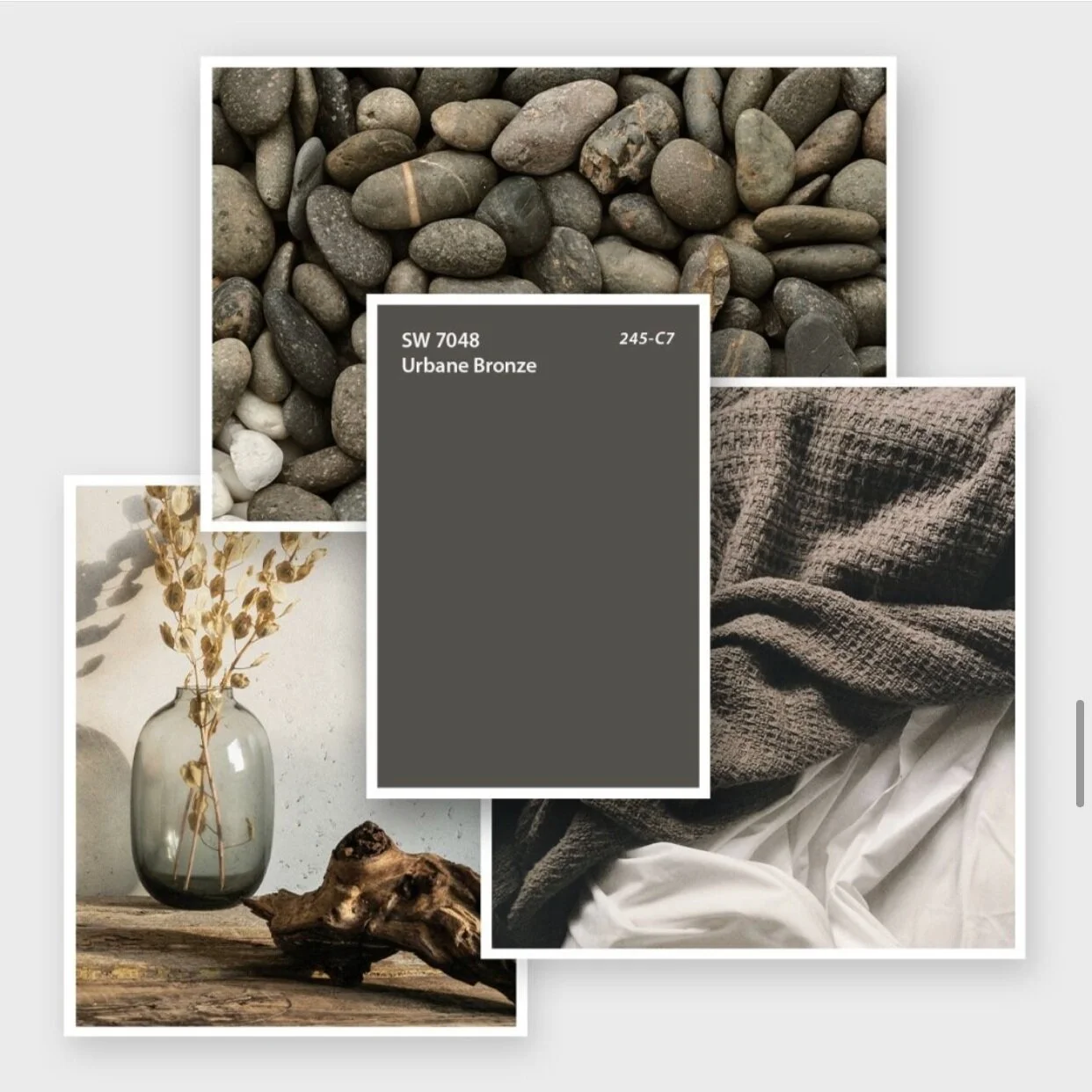
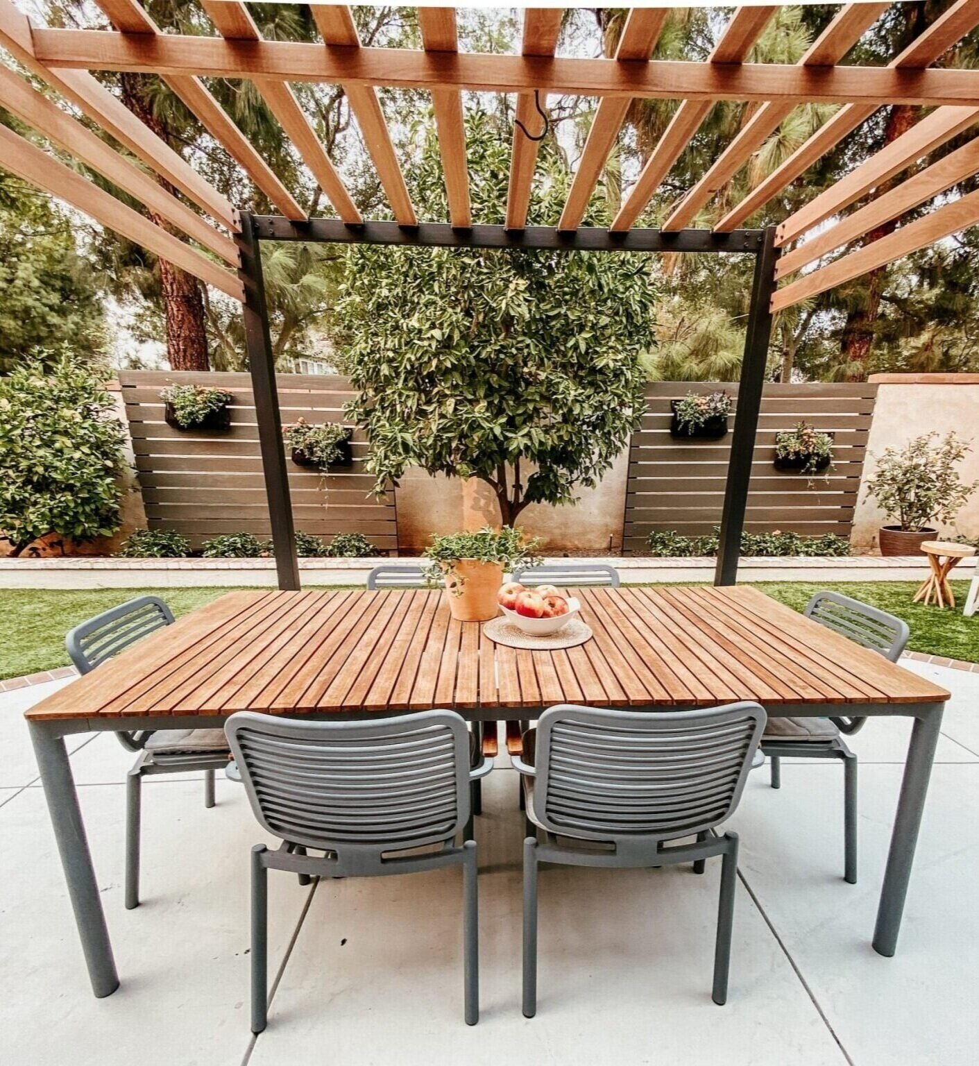
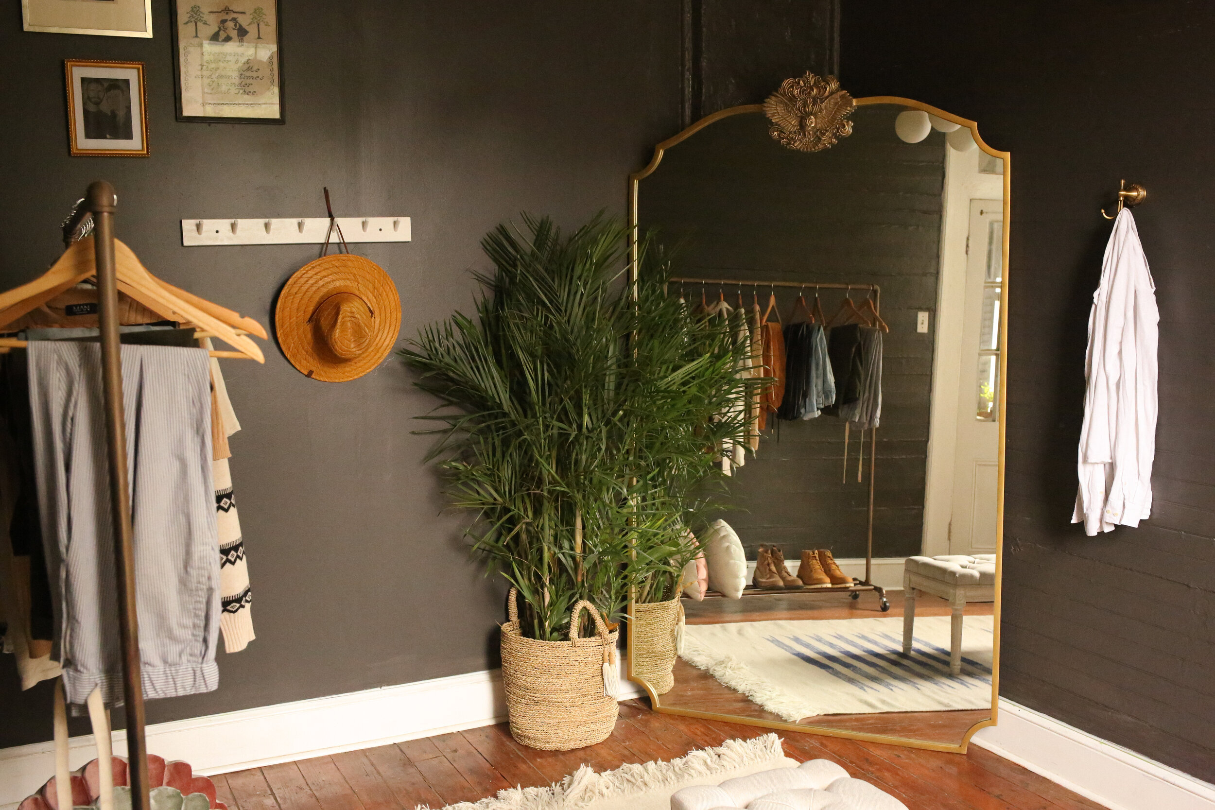
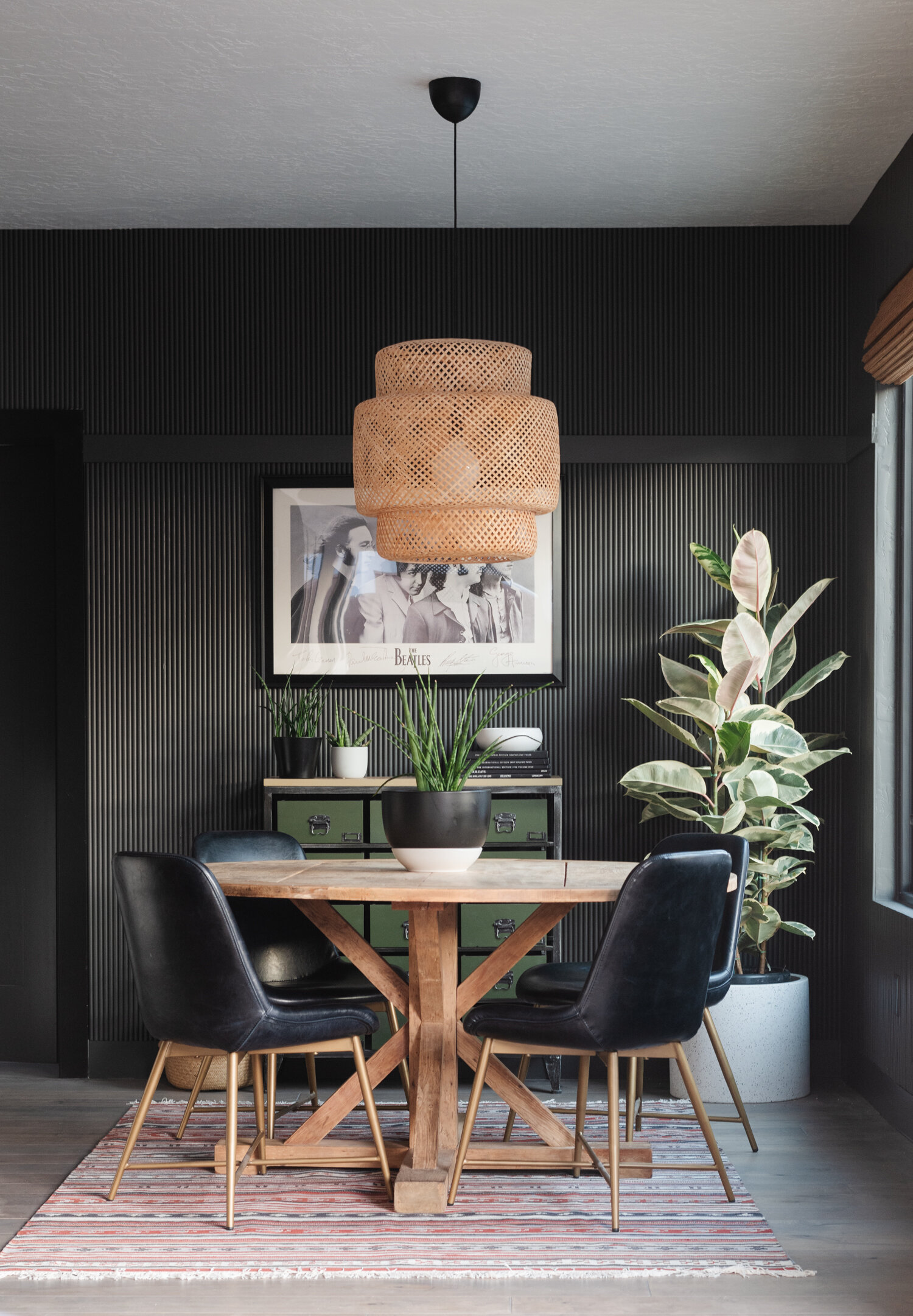
Sherwin williams Color of the year: Urbane Bronze
I might be saving the best for last… Sherwin Williams has picked Urbane Bronze as their color of the year and I cant think of a more versatile and sophisticated color. I have been trying to convince everyone for years, that designing with a darker color can elevate a space while also bringing a sense of warmth, and that is exactly what Sherwin Williams is doing this year.
I hope you all are now inspired to add some of these beautiful colors into your space. Even if it is just a throw pillow, accent wall, or reclaiming an old piece of furniture. All of these colors were chosen to bring a sense of warmth and uplift any space they are in. So go for it, have some fun with these colors… and then tag me so I can see!
Cheers!
Annie
